Building a Castle: Part 3, Mosaic
Mosaic is great for content editors to have more control over the look and feel of their site. Mosaic is a central piece in what we are doing with Castle as we're removed all traditional content editing and replaced it with Mosaic.
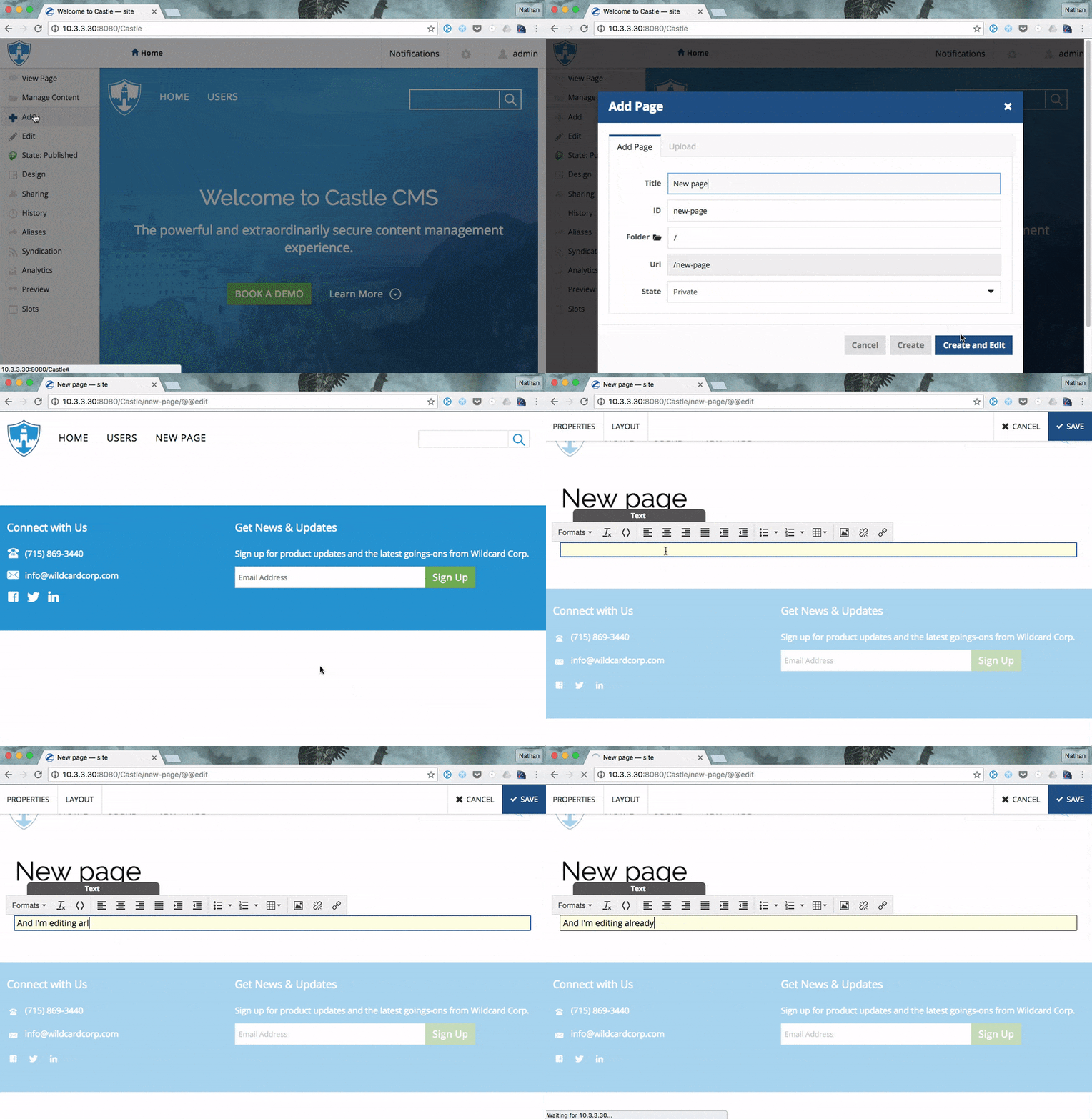
Mosaic editor enabled by default
With plone.app.mosaic, OOTB to edit your content with mosaic you:
- click to add content
- click save
- select mosaic display
- click edit
- select mosaic layout
- now you are editor
With Castle, we streamlined that process. Things mosaic does:
- every content type is mosaic enabled
- we've setup default mosaic content layouts for each type so you start editing immediately
- with our implementation of the add content form, it means your editors can start editing content immediately

Consistency
It's important to provide users a consistent way to interact with the system and less choices to have to deal with.
Using this approach, we were able to get rid of default page--one of the most confusing things to try and teach content editors about Plone.
We also no longer have a display menu. Anything that would go under display is either moved to a mosaic pre-defined layout or the user is expected to be able to build.
In doing this, we were able to get rid of 2 confusing aspects of Plone and provide a more consistent editing experience.